首页 文章

WPF切角元素

提问于
浏览
5

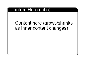
我正在尝试在WPF中创建类似于下图的内容 . 这个控件被设计成我应用程序中所有内容的基本视图,并且将位于具有背景的Window控件内(可能是某种渐变) .

要求如下:

  • 三面圆角(左上角,左下角和右下角)

  • 切断标签看右上角的背景,背后有"cut area"透明背景,所以窗口的背景渐变显示(看起来它真的被剪掉了)

  • Headers 区域应该是一个内容容器,所以我可以在其中放置任何内容,如图标和文本

  • 内容区域需要具有最小高度,然后在内部内容超过它时增长(不是动态 - 只需支持其中任何元素的高度)

我已经和我斗争了好几个小时,但是对于WPF来说,我开始发现自己在圈子里跑来跑去 . 我认为WPF的灵活性有很大的好处,但对于刚开始使用它的人来说几乎是太令人生畏了 .

任何帮助将非常感激!谢谢!

Content Layout

3 回答

  • 4

    Tabby

    我不知道如何'填充'剪辑,所以我用代码制作了剪辑 . 如果您需要更多帮助来添加更多属性来控制颜色等,请告诉我 .

    码:

    public class Tabby : HeaderedContentControl
    {
        static Tabby()
        {
            DefaultStyleKeyProperty.OverrideMetadata(typeof(Tabby), new FrameworkPropertyMetadata(typeof(Tabby)));
        }
    
        public double DogEar
        {
            get { return (double)GetValue(DogEarProperty); }
            set { SetValue(DogEarProperty, value); }
        }
    
        public static readonly DependencyProperty DogEarProperty =
            DependencyProperty.Register("DogEar",
            typeof(double), 
            typeof(Tabby),
            new UIPropertyMetadata(8.0, DogEarPropertyChanged));
    
        private static void DogEarPropertyChanged(
            DependencyObject obj, 
            DependencyPropertyChangedEventArgs e)
        {
            ((Tabby)obj).InvalidateVisual();
        }
    
        public Tabby()
        {
            this.SizeChanged += new SizeChangedEventHandler(Tabby_SizeChanged);
        }
    
        void Tabby_SizeChanged(object sender, SizeChangedEventArgs e)
        {
            var clip = new PathGeometry();
            clip.Figures = new PathFigureCollection();
            clip.Figures.Add(
                new PathFigure(
                    new Point(0, 0),
                    new[] {
                        new LineSegment(new Point(this.ActualWidth - DogEar, 0), true),
                        new LineSegment(new Point(this.ActualWidth, DogEar), true), 
                        new LineSegment(new Point(this.ActualWidth, this.ActualHeight), true),
                        new LineSegment(new Point(0, this.ActualHeight), true) },
                    true)
            );
            this.Clip = clip;
        }
    }
    

    Generic.xaml

    <Style TargetType="{x:Type local:Tabby}">
        <Setter Property="Padding"
                Value="5" />
        <Setter Property="Template">
            <Setter.Value>
                <ControlTemplate TargetType="{x:Type local:Tabby}">
                    <Grid>
                        <Grid.RowDefinitions>
                            <RowDefinition Height="auto" />
                            <RowDefinition Height="auto" />
                        </Grid.RowDefinitions>
                        <Border CornerRadius="3,0,0,0"
                                BorderBrush="Black"
                                BorderThickness="1"
                                Background="Black">
                            <ContentPresenter Content="{TemplateBinding Header}"
                                              Margin="{TemplateBinding Padding}" />
                        </Border>
                        <Border CornerRadius="0,0,3,3"
                                BorderBrush="Black"
                                BorderThickness="1"
                                Background="White"
                                Grid.Row="1">
    
                            <ContentPresenter Content="{TemplateBinding Content}"
                                              Margin="{TemplateBinding Padding}" />
                        </Border>
                    </Grid>
    
                </ControlTemplate>
            </Setter.Value>
        </Setter>
    </Style>
    

    使用它:

    <my:Tabby DogEar="12"
              x:Name="tabby1">
        <my:Tabby.Header>
            <TextBlock Foreground="White">Header</TextBlock>
        </my:Tabby.Header>
        <my:Tabby.Content>
            <TextBlock Text="Content can be anything" />
        </my:Tabby.Content>
    </my:Tabby>
    
  • 4

    试试这个开始吧:

    <Grid Width="100" Height="100">  
        <Border Background="Green" CornerRadius="8,0,8,8">
          <Border.Clip>
            <PathGeometry>
              <PathGeometry.Figures>
                <PathFigure StartPoint="0,0">
                  <PathFigure.Segments>
                    <LineSegment Point="90,0"/>
                    <LineSegment Point="100,10"/>
                    <LineSegment Point="100,100"/>
                    <LineSegment Point="0,100"/>
                  </PathFigure.Segments>
                </PathFigure>
              </PathGeometry.Figures>
            </PathGeometry>
          </Border.Clip>
        </Border>
      </Grid>
    
  • 0

    这是我使用自定义控件放在一起的一些代码 .

    控制代码:

    using System;
    using System.Windows;
    using System.Windows.Controls;
    
    namespace Test
    {
        public class ContentCard : HeaderedContentControl
        {
            static ContentCard()
            {
                DefaultStyleKeyProperty.OverrideMetadata(typeof(ContentCard), new FrameworkPropertyMetadata(typeof(ContentCard)));
            }
        }
    }
    

    控制xaml(在Themes / Generic.xaml文件夹中)

    <ResourceDictionary xmlns="http://schemas.microsoft.com/winfx/2006/xaml/presentation"
                        xmlns:x="http://schemas.microsoft.com/winfx/2006/xaml"
                        xmlns:test="clr-namespace:Test">
        <Style TargetType="{x:Type test:ContentCard}">
            <Setter Property="Template">
                <Setter.Value>
                    <ControlTemplate TargetType="{x:Type test:ContentCard}">
                        <Grid  Background="Transparent">
                            <Grid.RowDefinitions>
                                <RowDefinition Height="30" />
                                <RowDefinition Height="*" />
                            </Grid.RowDefinitions>
                            <Grid.ColumnDefinitions>
                                <ColumnDefinition Width="*" />
                                <ColumnDefinition Width="20" />
                            </Grid.ColumnDefinitions>
    
                            <Border Grid.Row="0" Grid.Column="0" Background="{TemplateBinding Background}" CornerRadius="10,0,0,0" Height="30">
                                <ContentControl Content="{TemplateBinding Header}" VerticalAlignment="Center" Margin="10,0,0,0" />
                            </Border>
                            <Path Grid.Row="0" Grid.Column="1" Fill="{TemplateBinding Background}" Data="M0,0 L20,15 L20,30 L0,30 L0,0Z"/>
                            <Border Grid.Row="1" Grid.ColumnSpan="2" BorderBrush="{TemplateBinding Background}" BorderThickness="1,0,1,1" CornerRadius="0,0,10,10" Padding="5" Background="White">
                                <ContentControl Content="{TemplateBinding Content}" />
                            </Border>
                        </Grid>
                    </ControlTemplate>
                </Setter.Value>
            </Setter>
        </Style>
    </ResourceDictionary>
    

    这是你如何使用它:

    <test:ContentCard Grid.RowSpan="4" Grid.ColumnSpan="2" Margin="200" Background="Black">
        <test:ContentCard.Header>
            <TextBlock Text="Title" Foreground="White" />
        </test:ContentCard.Header>
        <test:ContentCard.Content>
            <TextBlock Text="This is some content" Foreground="Black" />
        </test:ContentCard.Content>
    </test:ContentCard>
    

相关问题