在悬停时激活了一个纯CSS(无JavaScript)下拉菜单,如果单击它,菜单将保持打开状态 .
它在这里:Making Animated Dropdown Menu by Using Pure CSS Like Bootstrap does
这是代码:
html, body {
    margin:0;
}
.acn-menu {
    text-align: center;
    background-color: rgba(0, 0, 0, 0.9);
    border-bottom-left-radius: 5px;
    border-bottom-right-radius: 5px;
    min-height: 74px;
    width: 100%;
}
.label_openclose {
    display: none;
}
.menu-tabs {
    height: 100%;
}
.menu-tabs .elem {
    box-sizing: border-box;
    padding: 0 20px;
    float: left;
    height: 100%;
    line-height: 70px;
    background-color: rgb(30, 30, 30);
    color: white;
}
@-webkit-keyframes spin {
    0% {
        transform: rotate(-180deg);
    }
    50% {
        transform: rotate(180deg);
    }
    100% {
        transform: rotate(-180deg);
    }
}
@keyframes spin {
    0% {
        transform: rotate(-180deg);
    }
    50% {
        transform: rotate(180deg);
    }
    100% {
        transform: rotate(-180deg);
    }
}
.menu-check:checked ~ .label_openclose {
    -webkit-animation-play-state: paused;
    animation-play-state: paused;
}
.menu-check {
    display: none;
}
.menu-tabs .elem:hover {
    background-color: rgba(255, 255, 255, 0.2);
}
/*@media screen and (max-width:55%)*/
 @media screen and (max-width:768px) {
    .label_openclose {
        -webkit-animation: spin 2s;
        animation: spin 2s;
        display: inline-block;
        transform: rotate(-180deg);
        transition-duration: 1s;
        margin: 10px;
        width: 30px;
        height: 30px;
        border-radius: 50%;
        border-top: 10px solid rgb(50, 50, 50);
        border-right: 10px solid rgb(100, 100, 100);
        border-bottom: 10px solid rgb(150, 150, 150);
        border-left: 10px solid rgb(200, 200, 200);
        background-color: transparent;
        cursor: pointer;
    }
    .label_openclose:hover {
        transform: rotate(180deg);
    }
    .menu-tabs .elem {
        transition: border 1s linear, height 1s;
        line-height: initial;
        float: initial;
        height: 0px;
        cursor: pointer;
        border-top: 0px solid #000;
        overflow: hidden;
    }
    .menu-tabs:hover .elem {
        height: 25px;
    }
    .menu-check:checked ~ .menu-tabs .elem {
        height: 25px;
        color: white;
        border-top: 2px solid rgba(255, 255, 255, 0.2);
    }
    .label_openclose:hover ~ .menu-tabs .elem {
        border-top: 2px solid rgba(255, 255, 255, 0.2);
        height: 25px;
    }
}
<div class="acn-menu">
    <input type="checkbox" id="openclose" class="menu-check" />
    <label class="label_openclose" for="openclose"></label>
    <div class="menu-tabs">
        <div class="elem">test</div>
        <div class="elem">nav</div>
        <div class="elem">bar</div>
        <div class="elem">with</div>
        <div class="elem">transitions</div>
    </div>
</div>
<main>
    test content of main page</br>The navbar menu stays open when you click on the circle</br>and it even opens on hover, not just on click.
</main>
我会将下拉菜单中的“解决方案”放在导航栏中:
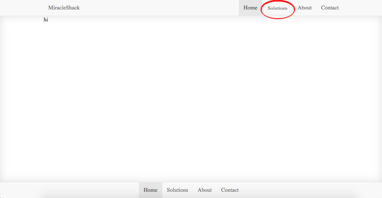
如何使用默认的bootstrap 3导航栏菜单进行此操作?
2 回答
诀窍是复选框中的
:checked和:hoverCSS伪类选择器与〜(通用兄弟组合子)组合 . 组合子(〜)听起来很复杂,但它基本上只是意味着选择〜之后的任何兄弟,如果它出现在〜之后的选择器之后的html中 . 例如:...
所以你基本上只需要(1)一个复选框元素(2)一个标签用于所述复选框,(3)一个菜单(包含你想要的多个孩子) . 所有这三个都必须是兄弟姐妹,以便检查/取消选中复选框可以通过psuedo-class选择器和〜combinator切换其他两个元素的类 .
在您显示的示例中,复选框显示设置为none,但这只是因为它很难看 . 它可以很容易地存在,菜单切换功能相同 . 您可以单独使用标签切换支票,因此这并不重要 . 但隐形复选框是让一切都发生的原因 . 您可以直接设置样式,如果您愿意,可以忘记标签 .
因此,您需要做的就是将菜单设置为隐藏,然后在〜组合器后面的菜单显示复选框是选中还是悬停:
...
在引导程序中找到完美的复制品可能是一种绝对的痛苦,或者它可能很容易,我不确定 . 但你真的不需要它 . 您可以使用切换选择器添加不可见的复选框,标签和菜单,然后使用bootstrap设置其他所有内容 . 您可能需要为级联过载,但最糟糕的是,您可以使用特殊的切换选择器id而不是类 .
这是一个极简主义的工作示例:
您可以使用
:focus. 看看example code .Drawback: 您无法切换下拉列表(您可以打开它但无法关闭它) .