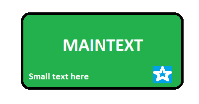
我正用这个拉我的头发 . 我正在尝试使用Xamarin Forms(可移植类库-PCL)创建自定义渲染器,以便在下面的图像中显示结果:
我需要的:
圆角
按钮外观(显示触摸)
"Normal"按钮标签位于中心
右上角的图片
左下方的文字较小 .
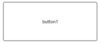
我已设法为普通按钮创建自定义渲染器,但无法添加小文本和图像 . 见下图
谢谢!
这可能有所帮助
使用 CardView 作为按钮,并按照按钮处理方式处理cardview上的点击事件
CardView
<android.support.v7.widget.CardView
android:layout_width="wrap_content"
android:layout_height="wrap_content"
card_view:cardCornerRadius="4dp"
card_view:contentPadding="4dp"
card_view:cardBackgroundColor="@color/darkorange"
android:id="@+id/view">
<RelativeLayout
    android:layout_width="wrap_content"
    android:layout_height="wrap_content">
    <TextView
        android:layout_width="wrap_content"
        android:layout_height="wrap_content"
        android:layout_centerInParent="true"
        android:layout_centerHorizontal="true"
        android:text="centered"/>
    <ImageButton
        android:layout_width="wrap_content"
        android:layout_height="wrap_content"
        android:id="@+id/imageButton"
        android:background="@android:color/transparent"
        android:src="@drawable/ic_menu_send"
        android:layout_alignParentBottom="true"
        android:layout_alignParentRight="true"
        android:layout_alignParentEnd="true" />

    <TextView
        android:layout_width="wrap_content"
        android:layout_height="wrap_content"
        android:textAppearance="?android:attr/textAppearanceSmall"
        android:text="Small Text"
        android:id="@+id/textView3"
        android:layout_alignParentBottom="true"
        android:layout_alignParentLeft="true"
        android:layout_alignParentStart="true" />
</RelativeLayout>
</android.support.v7.widget.CardView>
对于任何有兴趣的人来说,这是UWP的解决方案!
[assembly: ExportRenderer(typeof(RoundedButton), typeof(RoundedButtonRenderer))]
namespace Platformspecific.Buttons
{
    public class RoundedButtonRenderer : ViewRenderer<RoundedButton, Windows.UI.Xaml.Shapes.Rectangle>
    {
        Xamarin.Forms.Color originalBackground;
        private RoundedButton _control;

        protected override void OnElementChanged(ElementChangedEventArgs<RoundedButton> e)
        {
            base.OnElementChanged(e);

            if (e.NewElement != null)
            {
                _control = e.NewElement as RoundedButton;

                originalBackground = _control.CustomBackgroundColor;

                this.PointerPressed += Control_Pressed;
                this.PointerReleased += Control_Released;
                this.PointerExited += Control_Released;

                var rectangle = new Windows.UI.Xaml.Shapes.Rectangle();
                rectangle.Width = this.Width; // 100;
                rectangle.Height = this.Height;


                rectangle.Fill = new SolidColorBrush(ToMediaColor(_control.CustomBackgroundColor));

                rectangle.RadiusX = _control.BorderRadius;
                rectangle.RadiusY = _control.BorderRadius;


                rectangle.Stroke = new SolidColorBrush(ToMediaColor(_control.OutlineColor));
                rectangle.StrokeThickness = _control.BorderWidth;

                this.SetNativeControl(rectangle);


            }
        }


        public static Windows.UI.Color ToMediaColor(Xamarin.Forms.Color color)
        {
            return Windows.UI.Color.FromArgb(((byte)(color.A * 255)), (byte)(color.R * 255), (byte)(color.G * 255), (byte)(color.B * 255));
        }


        void Control_Pressed(object sender, PointerRoutedEventArgs e)
        {


            Windows.UI.Xaml.Shapes.Rectangle _rectangle = e.OriginalSource  as Windows.UI.Xaml.Shapes.Rectangle;


            var rectangle = new Windows.UI.Xaml.Shapes.Rectangle();
            rectangle.Width = this.Width;
            rectangle.Height = this.Height;
            rectangle.Fill = new SolidColorBrush(Windows.UI.Color.FromArgb(255, 100, 100, 100));
            rectangle.RadiusX = _control.BorderRadius;
            rectangle.RadiusY = _control.BorderRadius;
            rectangle.Stroke = new SolidColorBrush(ToMediaColor(_control.OutlineColor));
            rectangle.StrokeThickness = _control.BorderWidth;

            this.SetNativeControl(rectangle);

            e.Handled = false;
        }

        void Control_Released(object sender, PointerRoutedEventArgs e)
        {

            Windows.UI.Xaml.Shapes.Rectangle _rectangle = e.OriginalSource as Windows.UI.Xaml.Shapes.Rectangle;


            var rectangle = new Windows.UI.Xaml.Shapes.Rectangle();
            rectangle.Width = this.Width;
            rectangle.Height = this.Height;
            rectangle.Fill = new SolidColorBrush(Windows.UI.Color.FromArgb(((byte)(originalBackground.A * 255)), (byte)(originalBackground.R * 255), (byte)(originalBackground.G * 255), (byte)(originalBackground.B * 255)));
            rectangle.RadiusX = _control.BorderRadius;
            rectangle.RadiusY = _control.BorderRadius;
            rectangle.Stroke = new SolidColorBrush(ToMediaColor(_control.OutlineColor));
            rectangle.StrokeThickness = _control.BorderWidth;


            rectangle.Fill = new SolidColorBrush(ToMediaColor(_control.CustomBackgroundColor));
            rectangle.Stroke = new SolidColorBrush(ToMediaColor(_control.CustomBackgroundColor));


            this.SetNativeControl(rectangle);
            e.Handled = false;
        }


    }
}
2 回答
这可能有所帮助
使用
CardView作为按钮,并按照按钮处理方式处理cardview上的点击事件对于任何有兴趣的人来说,这是UWP的解决方案!