我需要有多色文本作为xamarin表单按钮,它针对IOS,Android以及将来的Win 10应用程序 . Xamarin Forms按钮控件不支持这种开箱即用,需要一些自定义 .
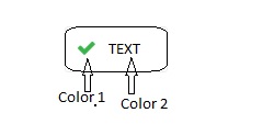
这是预期的样本按钮图像 .
您是否尝试在button上使用 Image 属性?
Image
所以你会得到以下内容:
<Button Text="Text" Image="Tick.png"/>
您可以设计自己的(或购买)复选标记图形,如图所示here:
我通常使用设计制作一个stacklayout,并在后 endpoints 击它,如下所示:
<StackLayout Margin="1" BackgroundColor="Black" Widthrequest="100" HeightRequest="50">
    <Stacklayout BackgroundColor="White" x:Name="yourButtonControl" Widthrequest="100" Orientation="Horizontal" Padding="5" HeightRequest="50">
        <Image Source="your image path" HorizontalOptions="StartAndExpand" />
        <Label HorizontalOptions="End">your text</Label>
    </StackLayout>
</StackLayout>
使StackLayout可点击:
var tapped = new TapGestureRecognizer();
tapped.Tapped += clickedEvent;
yourButtonControl.GestureRecognizers.Add(tapped);
你的活动:
public void clickedEvent(Object sender, EventArgs e){

}
您可以为Button创建自定义渲染 . iOS和Android都支持图像和文本按钮 . Windows没有,这就是为什么它不支持开箱即用的表单 .
请查找iOS渲染器示例:
public class DashboardButtonRenderer : ButtonRenderer
{
    private const int ImageSize = 25;

    private UIButton _button;
    private DashboardButton _dashboardButton;

    protected override void OnElementChanged(ElementChangedEventArgs<Button> e)
    {
        base.OnElementChanged(e);
        if (e?.OldElement == null && e.NewElement != null)
        {
            _button = Control;
            e.NewElement.BorderRadius = 0;
            _dashboardButton = (DashboardButton)e.NewElement;
            _button.Font = UIFont.SystemFontOfSize((nfloat)_dashboardButton.FontSize, UIFontWeight.Semibold);
        }
    }

    protected override void OnElementPropertyChanged(object sender, PropertyChangedEventArgs e)
    {
        base.OnElementPropertyChanged(sender, e);
        if (e?.PropertyName == DashboardButton.BadgeCountProperty.PropertyName)
        {
            AddBadgeToButton(_dashboardButton.BadgeCount);
        }
        if (e?.PropertyName == VisualElement.IsEnabledProperty.PropertyName)
        {
            _button.Enabled = _dashboardButton.IsEnabled;
        }
    }

    public override void LayoutSubviews()
    {
        base.LayoutSubviews();

        if (string.IsNullOrEmpty(_dashboardButton?.ButtonImage))
        {
            return;
        }
        SetImage();     //Moved from ondraw to handle Device Orientation Change
    }

    public override void Draw(CGRect rect)
    {
        base.Draw(rect);
        Control.HorizontalAlignment = UIControlContentHorizontalAlignment.Center;
    }

    private void SetImage()
    {
        CGSize labelSize = Sizing.GetStringSize(_dashboardButton.Text, (float)_dashboardButton.FontSize, 0f, 0f, UIFontWeight.Semibold);

        UIImage image = new UIImage(_dashboardButton.ButtonImage);
        _button.SetTitle(_dashboardButton.Text, UIControlState.Normal);
        image = ImageHelper.ResizeImage(image, ImageSize, ImageSize);
        _button.SetImage(image, UIControlState.Normal);
        _button.TintColor = UIColor.Gray;

        var imageAllottedSpaceCenterY = (Control.Frame.Size.Height - _button.TitleLabel.Frame.Size.Height) / 2;

        var imageInsetTopBottom = imageAllottedSpaceCenterY - ImageSize / 2;
        var imageInsetLeftRight = Control.Frame.Size.Width / 2 - ImageSize / 2;

        var labelInsetBottom = (Control.Frame.Size.Height - ImageSize) / 2 - _button.Frame.Height / 2;
        var labelInsetLeftRight = _button.Frame.Width / 2 - labelSize.Width / 2;

        _button.ImageEdgeInsets = new UIEdgeInsets(imageInsetTopBottom, imageInsetLeftRight, imageInsetTopBottom, imageInsetLeftRight);

        var labelInsetRight = Device.Idiom != TargetIdiom.Phone ? labelInsetLeftRight + GetLabelLeftOffset(_dashboardButton.Text) : labelInsetLeftRight;

        _button.TitleEdgeInsets = new UIEdgeInsets(labelInsetBottom + imageInsetTopBottom + 30
        , labelInsetLeftRight - labelSize.Width / 2 + GetLabelLeftOffset(_dashboardButton.Text)
        , labelInsetBottom, labelInsetRight);
        AddBadgeToButton(_dashboardButton.BadgeCount);
        _button.TintColor = AgvanceColors.TintColor.ToUIColor();
    }
}
如果你需要设置的只是多色按钮的文本,那么你可以使用this解决方案的iOS .
我会选择绝对布局,因为我可以将布局中的元素完全放在我想要的位置 . 只需在布局顶部添加一个透明按钮,这样整个布局就像一个按钮
<AbsoluteLayout HeightRequest="50" WidthRequest="150">
    <Image Source="Check.png"
        AbsoluteLayout.LayoutFlags="All"
        AbsoluteLayout.LayoutBounds="0.1, 0.5, 0.2, 1.0"/>
    <Label Text="TEXT"
        AbsoluteLayout.LayoutFlags="All"
        AbsoluteLayout.LayoutBounds="0.9, 0.5, 0.7, 1.0"/>
    <Button Clicked="ButtonClicked" BackgroundColor="Transparent" BorderWidth="2"
        AbsoluteLayout.LayoutFlags="All"
        AbsoluteLayout.LayoutBounds="0.5, 0.5, 1.0, 1.0"/>
</AbsoluteLayout>
而事件
public void ButtonClicked(Object sender, EventArgs args)
{
    // do something
}
4 回答
您是否尝试在button上使用
Image属性?所以你会得到以下内容:
您可以设计自己的(或购买)复选标记图形,如图所示here:
我通常使用设计制作一个stacklayout,并在后 endpoints 击它,如下所示:
使StackLayout可点击:
你的活动:
您可以为Button创建自定义渲染 . iOS和Android都支持图像和文本按钮 . Windows没有,这就是为什么它不支持开箱即用的表单 .
请查找iOS渲染器示例:
如果你需要设置的只是多色按钮的文本,那么你可以使用this解决方案的iOS .
我会选择绝对布局,因为我可以将布局中的元素完全放在我想要的位置 . 只需在布局顶部添加一个透明按钮,这样整个布局就像一个按钮
而事件