我们需要调整下拉列表的样式,以便在使用Google地方信息/ Map 自动填充API时显示自动填充位置建议 .
有谁知道这是否可能?如果是这样,我想我们只需要知道CSS类名/ ID .
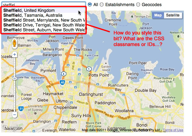
我在这里指的是一个屏幕抓取:
这现在由谷歌记录:https://google-developers.appspot.com/maps/documentation/javascript/places-autocomplete#style_autocomplete
这个CSS将允许下拉调整大小以适应结果的宽度:
.pac-container, .pac-item {
    width: inherit !important;
}
如果您使用firebug(如对您的问题的评论中所述......),您会看到具有自动完成结果的容器是具有“pac-container”类的DIV,并且建议在其中作为具有类的DIV“ PAC-项目” . 所以只用CSS风格 .
我的情况下,任何人都对层次结构感兴趣我能够使用 Firebug 抓取以下内容:
Firebug
<div class="pac-container pac-logo" style="width: 557px; position: absolute; left: 66px; top: 106px; display: none;">
    <div class="pac-item">
        <span class="pac-icon pac-icon-marker"></span>
        <span class="pac-item-query">
            <span>France</span>
        </span>
    </div>
<div>
这对我有用,现在我可以在手机上运行了!
.pac-container {
    z-index: 10000 !important;
    width: auto !important;
    position: initial !important;
    left: 0 !important;
    right: 0 !important;
    display: block !important;
}
.pac-container:empty{
    display: none !important;
}
这个地方!
$( '选择')附加( 'PAC-容器 . ');
现在结果将在选定的div中显示为正常的块元素:)
检查元素非常困难,因为它一旦失去焦点就会关闭 .
虽然我们知道容器有 .pac-container 类,而且项目有 .pac-item ,但在进一步调查API后,我发现它在文档中嵌入了CSS样式 .
.pac-container
.pac-item
这是最初的内容,因此请使用它来更改预定义的样式以满足您的需求 .
.pac-container {
    background-color: #fff;
    position: absolute!important;
    z-index: 1000;
    border-radius: 2px;
    border-top: 1px solid #d9d9d9;
    font-family: Arial, sans-serif;
    box-shadow: 0 2px 6px rgba(0, 0, 0, 0.3);
    -moz-box-sizing: border-box;
    -webkit-box-sizing: border-box;
    box-sizing: border-box;
    overflow: hidden
}

.pac-logo:after {
    content: "";
    padding: 1px 1px 1px 0;
    height: 16px;
    text-align: right;
    display: block;
    background-image: url(https://maps.gstatic.com/mapfiles/api-3/images/powered-by-google-on-white3.png);
    background-position: right;
    background-repeat: no-repeat;
    background-size: 120px 14px
}
.hdpi.pac-logo:after {
    background-image: url(https://maps.gstatic.com/mapfiles/api-3/images/powered-by-google-on-white3_hdpi.png)
}
.pac-item {
    cursor: default;
    padding: 0 4px;
    text-overflow: ellipsis;
    overflow: hidden;
    white-space: nowrap;
    line-height: 30px;
    text-align: left;
    border-top: 1px solid #e6e6e6;
    font-size: 11px;
    color: #999
}
.pac-item:hover {
    background-color: #fafafa
}
.pac-item-selected,
.pac-item-selected:hover {
    background-color: #ebf2fe
}
.pac-matched {
    font-weight: 700
}
.pac-item-query {
    font-size: 13px;
    padding-right: 3px;
    color: #000
}
.pac-icon {
    width: 15px;
    height: 20px;
    margin-right: 7px;
    margin-top: 6px;
    display: inline-block;
    vertical-align: top;
    background-image: url(https://maps.gstatic.com/mapfiles/api-3/images/autocomplete-icons.png);
    background-size: 34px
}
.hdpi .pac-icon {
    background-image: url(https://maps.gstatic.com/mapfiles/api-3/images/autocomplete-icons_hdpi.png)
}
.pac-icon-search {
    background-position: -1px -1px
}
.pac-item-selected .pac-icon-search {
    background-position: -18px -1px
}
.pac-icon-marker {
    background-position: -1px -161px
}
.pac-item-selected .pac-icon-marker {
    background-position: -18px -161px
}
.pac-placeholder {
    color: gray
}
6 回答
这现在由谷歌记录:https://google-developers.appspot.com/maps/documentation/javascript/places-autocomplete#style_autocomplete
这个CSS将允许下拉调整大小以适应结果的宽度:
如果您使用firebug(如对您的问题的评论中所述......),您会看到具有自动完成结果的容器是具有“pac-container”类的DIV,并且建议在其中作为具有类的DIV“ PAC-项目” . 所以只用CSS风格 .
我的情况下,任何人都对层次结构感兴趣我能够使用
Firebug抓取以下内容:这对我有用,现在我可以在手机上运行了!
这个地方!
$( '选择')附加( 'PAC-容器 . ');
现在结果将在选定的div中显示为正常的块元素:)
检查元素非常困难,因为它一旦失去焦点就会关闭 .
虽然我们知道容器有
.pac-container类,而且项目有.pac-item,但在进一步调查API后,我发现它在文档中嵌入了CSS样式 .这是最初的内容,因此请使用它来更改预定义的样式以满足您的需求 .